.png)
Most people have experienced the frustration of getting lost in an unfamiliar building or campus. That confusion isn't just a minor inconvenience, it affects the first impression of that organisation. When someone can't find their way, that negative experience stays with them even after they've reached their destination.
Poor wayfinding doesn't just frustrate visitors, it affects operational efficiency too. Staff spend valuable time giving directions that proper signage could handle, and first impressions suffer when guests arrive annoyed after navigation difficulties. Here are the most common mistakes organisations make with their wayfinding signage.
1. Facing Signs In The Wrong Direction
One of the most common wayfinding errors is positioning signs at angles that visitors can't easily see. The viewing angle diagram below illustrates the issue perfectly - single-sided signs need to be angled properly relative to traffic flow for maximum visibility. Many signs are positioned parallel to roadways, creating those limited viewing areas (shown in red) where motorists barely have time to read them.
The optimal viewing areas (green zones) are created when signs are oriented at specific angles to approaching traffic. Double-sided signs provide even better visibility from multiple directions.

2. Installing Signs Too Low
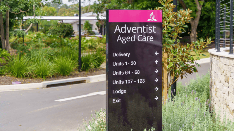
Signage positioned below shoulder height can get easily blocked by crowds or vehicles. For effective visibility, wayfinding signage should sit at eye level or higher (typically 1.5 to 2 metres from the ground for pedestrian areas and higher for areas where people will view them from vehicles).
This becomes especially important in educational settings or shopping centres where large groups frequently gather. A sign that looks perfectly visible when installed can easily disappear entirely behind a small crowd.
![]()
3. Placing Directional Signage Behind Parking Spots
It’s frustrating when visitors park in front of directional signs and, as a result, can’t spot the signage they need to find their way. This often leads to confusion, backtracking, or wandering around. Directional signage should be positioned where it remains visible regardless of parking patterns, usually on elevated poles or building facades.
Consider the worst-case scenario: a full car park. Will your critical directional information still be visible? If not, it's time to reposition those signs.
4. Mounting Signs On Doors Or Gates
Putting signage on doors or gates can create problems. When the door is propped open, that strategically positioned sign might be facing a wall when visitors need it most. Critical information belongs on fixed surfaces for consistent visibility.
The solution isn't complicated: place your main sign, whether that be a directional or door sign, on walls or dedicated posts that remain visible regardless of door positions. Door signage should be limited to room numbers or names.
5. Too Much Information On Signage
Some signs try to say too much at once. People will usually scan signage quickly while moving, giving you about three seconds to convey information. If too much information is used on signage, people tend to zone out and not take anything in. Keep it simple with a clear hierarchy: primary information should be the largest and most prominent, with secondary details in smaller text below.
Testing your signs with first-time visitors can be revealing. If they can't understand the main message at a glance, you've likely included too much information.
6. Poor Colour Contrast
Signs with weak contrast between text and background are tough to read, especially in poor lighting. What may look stylish in a design portfolio often fails in the real world. Black text on white (or vice versa) works best for most audiences. It is easy to incorporate your brand colours in the initial design of your signage in other ways, rather than changing the text colours.
7. Arrow Placement In Directional Signage
Directional signs that include arrows can result in less frustration from the visitor, and also ensure a sign doesn’t feel overwhelming to read. The arrows should be strategically placed on the right-hand side of the sign as viewers read from left to right. This reduces the confusion of visitors, as the viewer will read the location and then the direction on how to get there.
8. Delaying Updates Due To Future Changes
Many organisations put off signage improvements because of potential upcoming changes: "we're planning to renovate next year" or "our branding might change soon." This "perfect inaction" leads to years of visitor confusion.
Our signage solutions allow for signs to be easily changed. If there are planned building works, we can manufacture the signage so that it can be moved in the future with the use of base plates. If there is a rebrand, we can easily re-skin the sign instead of creating a whole new sign.
Well-designed wayfinding signage deserves ongoing attention rather than being perpetually postponed. But even short-term signage solutions can significantly improve visitor experiences while waiting for larger planned changes. The cost of short-term solutions is easily justified by the reduction in staff interruptions alone.
9. Typography That Is Too Hard To Read
Font choice can make or break a wayfinding system. Sans-serif fonts like Helvetica work better from a distance than decorative or script fonts. Font size matters too; we recommend that for each 7.5 metres of viewing distance, there should be an increase of at least 25mm in letter height for proper legibility.
Font consistency is equally important. Switching between multiple typefaces across your facility creates a negative impression on your organisation and appears unprofessional.
10. Gate Signage - Numbering Your Entrances
Arriving at "Gate A" when looking for the "Main Entrance" gives visitors no clue which direction to head next. Sequential numbering helps people understand their location within your site. Rather than using descriptive terms like "North Entrance" or “Gate A”, a clear numbering system like “Gate 1” helps visitors navigate intuitively and works across language barriers.
This becomes particularly important in large facilities like hospitals or universities, where there are multiple entrances and various languages are used. Numbers translate across all languages, while "Gate A" does not.
Real Results From Better Wayfinding
The before-and-after image below from Tintern Grammar shows what a difference thoughtful wayfinding makes. Their gate signage transformation demonstrates how strategic improvements can significantly enhance visitor experiences.
Before

After

Well-designed wayfinding signage guides visitors without drawing attention to itself. The goal is for people to reach their destination calm and oriented, not frustrated and late. This creates a better impression of your organisation and frees your staff from constantly giving directions.
Ready to improve your organisation's wayfinding system? Download our Signage Checklist or complete our VSW Checklist Quiz to see if your signs need a refresh.