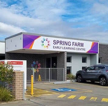
— ChildCARE Signage
CHILDCARE SIGNAGE
We specialise in supporting childcare centers to achieve consistent, high-quality signage across multiple locations. Our unique site auditing approach ensures every sign aligns with your brand’s identity while adapting to each childcare center's specific needs. We partner with you to protect and enhance your brand’s identity.
At Corporate Sign Industries, we create a comprehensive signage family design for your childcare centre. This details materials, finishes and design specifications, and it ensures every sign is designed to reflect your brand no matter where it might be installed.
Consistency with your signage is essential for building trust and enhancing brand recognition, but with our expertise and attention to detail, we will support you to protect and elevate your brand image at every touchpoint.
Call us today to discuss your signage requirements.
.webp)
IDENTITY SIGNAGE
Creating a consistent and welcoming brand identity is crucial in differentiating your childcare facility. Identity signage is a cost-effective tool to create a memorable impression and enhance brand identity. We will help you create a unique brand identity, leveraging creative designs, eye-catching colours, innovative technology, and memorable messaging.

RECEPTION SIGNAGE
Well-designed reception signage directs parents, caregivers, and visitors where they need to go. It also contributes to brand image, ensuring consistency and creating a memorable first impression.
.png?width=1200&height=800&name=6%20(1).png)
DOOR SIGNAGE
Effective door signage eliminates daily confusion for parents, caregivers, and first-time visitors. This is invaluable in providing clear identifiers for reception areas, infant rooms, sleep rooms, and staff rooms. They also ensure crucial information is visible and emergency areas are clear.
%20(1).png?width=1200&height=800&name=Childcare%20door%20signage%20(1)%20(1).png)
PYLON SIGNAGE
A pylon sign creates a strong visual marker at your entrance or along main roads, establishing your presence and guiding people to your location. Positioned prominently, these freestanding structures are visible from a distance and work across all environments.
%20(1)-1.jpg?width=3073&height=2258&name=20210723_110556%20(1)%20(1)-1.jpg)


