Considerations when installing roadside signs

If you want to install a roadside sign, there are a few considerations to make in the planning phase. In our years in the signage industry, we’ve learned a thing or two about signage and what takes it to the next level.
When it comes to signage installed alongside the road, there are five contributing factors – location, position, design, messaging, and adaptability.
In this article, we discuss each of these considerations and share our expert advice for installing roadside signage at your school or business. Use these techniques to maximise the benefit of your signage and ensure your audience is receiving the right messaging.
1. Location
The location of your roadside sign will determine how many people see and read it. Ideally, the sign should be easy for drivers and pedestrians to read. Before deciding your sign’s location, tour the site to try various angles and distances. Also, take note of any overhanging foliage, fences, or buildings that may block people’s view.
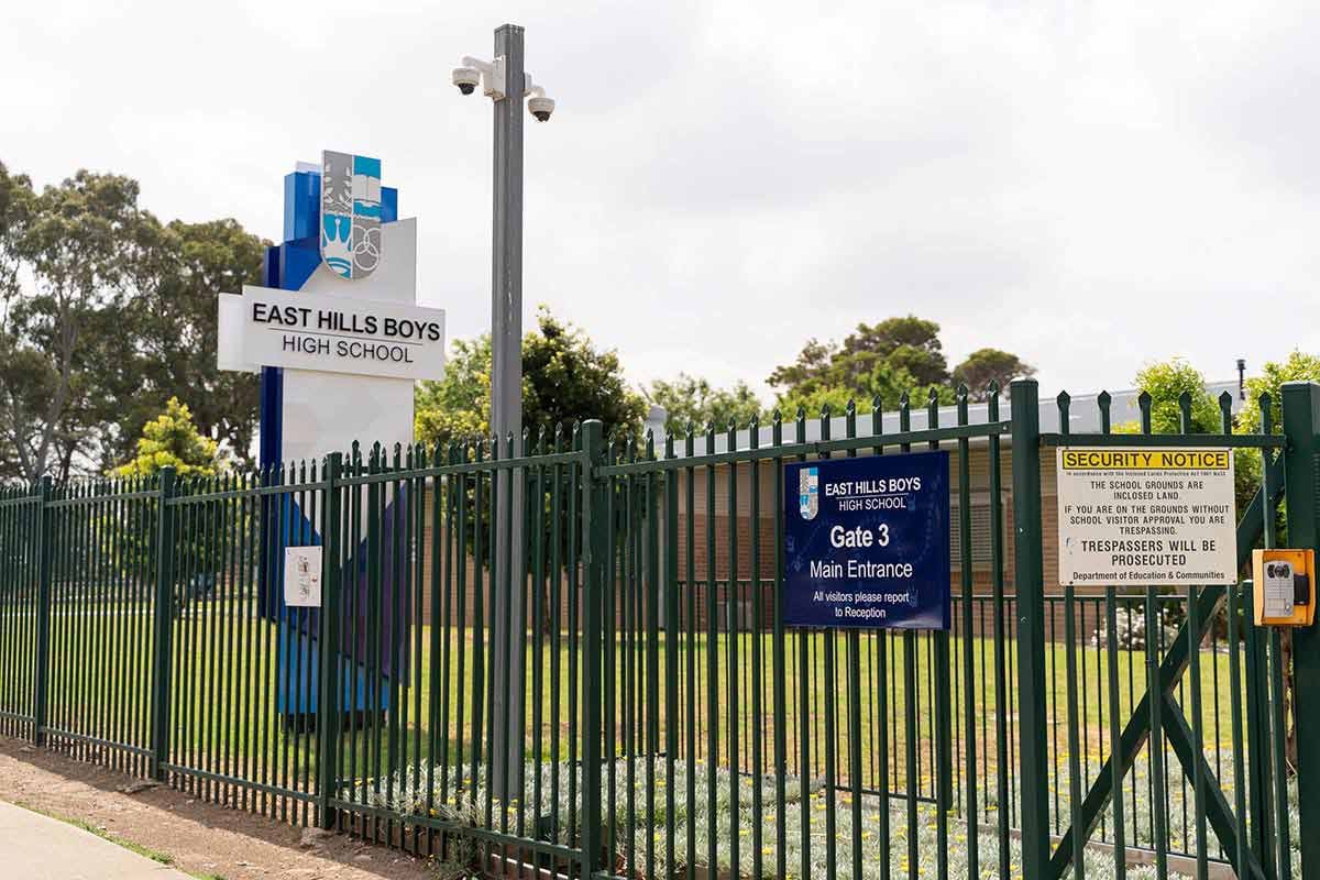
For example, the identity signage at East Hills Boys High School stands proudly along a main road, clearly visible above the fence and away from any trees to make it easily viewed by motorists.

2. Sign position and visibility
One of the most important considerations for roadside signs is the positioning in relation to the road. While it may be tempting to place the sign parallel to the road, this dramatically reduces how many drivers will see it. Even if drivers do see it, they won’t be able to absorb all the information in such a short window of time.

Instead, we always place roadside signs perpendicular to the road. This creates more viewing opportunities for drivers, as shown in the example below. This is the same concept used for road signs, such as speed limit signs and exit signs.
For example, the digital sign at Edenbrook Secondary College is double-sided and perpendicular to the road. This way, more people can see the messages and spend longer taking in the information.
Double-sided signs have a higher chance of being noticed and read by passersby. While a single-sided sign may be suitable for some locations, such as a one-way street, we typically recommend a double-sided configuration because it doubles the amount of optimum viewing area, as shown in the diagram.
.jpg?width=2000&height=1332&name=Edenbrook_secondary-34%20(1).jpg)
3. Memorable sign design
To ensure your signage stands out, our designers incorporate your school colours, clear fonts, and a well-balanced layout. They’ll also think about the surroundings and design the sign accordingly. For example, if your sign is surrounded by concrete and grey buildings, we will incorporate bright colours.
Another option is to use illumination features, which make your sign visible and captivating, even at night. For example, see this identity sign for Mazenod College with a backlit logo and lettering.
.png?width=800&height=450&name=Corporate%20Sign%20Industries%20%20Blog%20image%20(1).png)
4. Messaging
Passersby can only read your sign for a short period so it’s vital that it only displays the most important messages. Short and simple messages are most effective, such as the company or school name and the motto. The easier your sign is to read, the more effective it will be at making an impression.
We typically avoid putting contact information on signs, including phone numbers, emails, and websites. It is rare for passersby to take note of this and will instead find the website themselves. Removing this information reduces clutter and maximises the chance of people taking the necessary information in.
For example, this LED sign at Belmont Christian College is straight to the point, showing the school name, event notice, and school motto.

5. Adaptability
While static signage has its advantages, in some circumstances it pays to have a sign that can be easily updated with new information, particularly a main sign that’s visible from a main road. Often called changeable signs, digital LED signs are an effective way to communicate key messages and promote important information as they arise.
The main benefit of an LED sign is that it can be updated with new information, simply by editing the display on your phone, computer or laptop from any location. This allows you to share updates with the wider community, can encourage more enrollments, and builds your school image.
Compared to a static sign that never changes, an LED sign is dynamic and eye-catching, with something new to draw people’s attention each time they pass.
At Corporate Sign Industries, our Electra digital signs are easy to use, high quality, and designed for Australian conditions with a contemporary aluminium design. Numerous variations and customisations are available so ask us for more information and recommendations tailored to your premises.
Book a discovery call

.png)
.jpg)
.jpg)